
Branding
Typography & Color
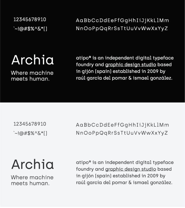
We used Perkly by Dyslexica for our logotype and Archia from atipo typeface foundry for the body copy because they translate the space where the machine meets human pretty well with the semi-geometrical ligature with some asymmetrical quirks.
We kept our primary colors monochrome to avoid any unnecessary contrast. To embellish the objects and action words we used our accent colors.